55. TinyBlog: Building a Web Interface with Seaside
55.1. Previous Week Solution
You can load the solution of the previous week using the following snippet:
Gofer new
   smalltalkhubUser: 'PharoMooc' project: 'TinyBlog';
   package: 'ConfigurationOfTinyBlog';
   load.
#ConfigurationOfTinyBlog asClass loadWeek3Correction
Make sure that you Teapot server is stopped.
TBTeapotWebApp stop55.2. A Web UI for TinyBlog with Seaside
The work presented in this exercise does not require the one on Voyage and MongoDB.
This week, we start with a web UI dedicated to display posts to users. Next week, we will develop another web UI for the blog owner to admnistrate the posts. In both cases, we will define Seaside components http://www.seaside.st which has a freely available book online here: http://book.seaside.st.
55.3. Start Seaside
There are two ways to start Seaside. The first one consists in executing the following code:
ZnZincServerAdaptor startOn: 8080.
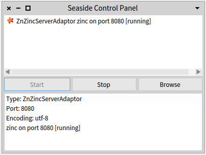
The second one uses the graphical tool named "Seaside Control Panel" (World Menu>Tools>Seaside Control Panel).
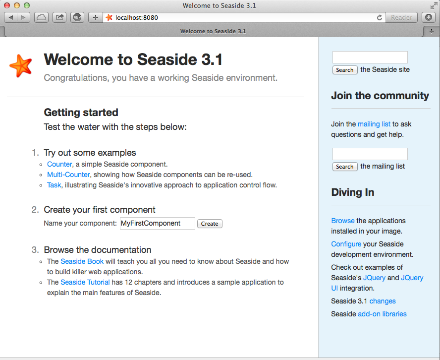
In the contextual menu (right clic) of this tool, select "add adaptor..." and add a server of type ZnZincServerAdaptor, then define the port number (e.g. 8080) it should run on (cf. figure 55.1). By opening a web browser on the URL http://localhost:8080, you should see the Seaside home page as displayed on Figure 55.2.
55.4. Entry Point for TinyBlog Web UI
Create a class named TBApplicationRootComponent which will be the entry point of the application.
WAComponent subclass: #TBApplicationRootComponent
   instanceVariableNames: ''
   classVariableNames: ''
   package: 'TinyBlog-Components'
On class-side, we implement the initialize method in the 'initialization' protocol to declare the application to Seaside. We also integrate dependencies to the Bootstrap framework (CSS and JS files will be embedded in the application).
TBApplicationRootComponent class >> initialize
   "self initialize"
   | app |
   app := WAAdmin register: self asApplicationAt: 'TinyBlog'.
   app
      addLibrary: JQDeploymentLibrary;
      addLibrary: JQUiDeploymentLibrary;
      addLibrary: TBSDeploymentLibrary
Once declared, you should execute this method with TBApplicationRootComponent initialize. Indeed, class-side initialize methods are executed at loading-time of a class but since the class already exists, we must execute it by hand.
We also add a method named canBeRoot to specify that TBApplicationRootComponent is not a simple Seaside component but a complete application. This component will be automatically instantiated when a user connects to the application.
TBApplicationRootComponent class >> canBeRoot
   ^ true
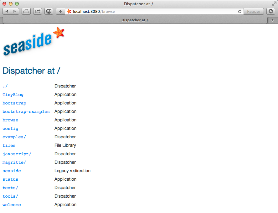
You can verify that your application is correctly registered by Seaside by connecting to the Seaside server through your web browser, click on "Browse the applications installed in your image" and then see that TinyBlog appears in the list.
55.5. First Simple Rendering
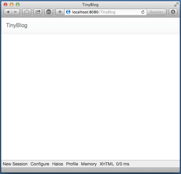
Let's add an instance method named renderContentOn: in rendering protocol to make our application displaying something.
TBApplicationRootComponent >> renderContentOn: html
   html text: 'TinyBlog'
If you open http://localhost:8080/TinyBlog in your web browser, the displayed a web should look like to the one on figure 55.4.
You can customize the web page header and declare it as HTML 5 compliant by redefining the updateRoot: method.
TBApplicationRootComponent >> updateRoot: anHtmlRoot
   super updateRoot: anHtmlRoot.
   anHtmlRoot beHtml5.
   anHtmlRoot title: 'TinyBlog'.
The TBApplicationRootComponent component is the root component of our application. It will not display a lot of things but will contain and display other components. For example, a component to display posts to the blog readers, a component to administrate the blog and its posts, ... Therefore, we decided that the TBApplicationRootComponent component will contain components inheriting from the abstract class named TBScreenComponent that we will now define.
55.6. Visual Components for TinyBlog
We are now ready to define multiple visual components for our application. The first chapters of http://book.seaside.st can help you and give more details than this tutorial if needed.
Figure 55.5 shows the different components to develop and where they are taking place.
55.6.1. TBScreenComponent Component
All components contained in TBApplicationRootComponent will be subclasses of the abstract class TBScreenComponent. This class allows us to factorize shared behaviors between all our components.
WAComponent subclass: #TBScreenComponent
   instanceVariableNames: ''
   classVariableNames: ''
   package: 'TinyBlog-Components'
All components need to access the model of our application. Therefore, in the 'accessing' protocol, we add a blog method that returns an instance of TBBlog (here the singleton).
TBScreenComponent >> blog
   "Return the current blog in the future we will ask the
   session to return the blog of the currently logged user."
   ^ TBBlog current
Inspect now the blog object returned by TBBlog current and verify that it contains some posts. If it does not, execute: TBBlog current createDemoPost.
In the future, if you want to manage multiple blogs, you will need to modify this method and use information stored in the active session to retrieve the current user/blog (cf. TBSession later on).
55.7. Bootstrap for Seaside
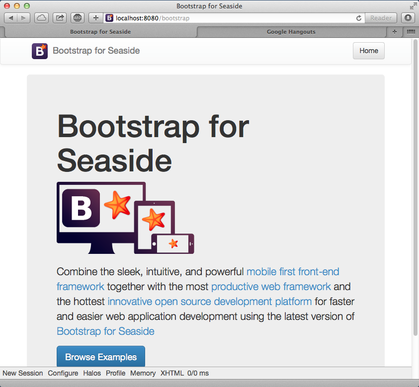
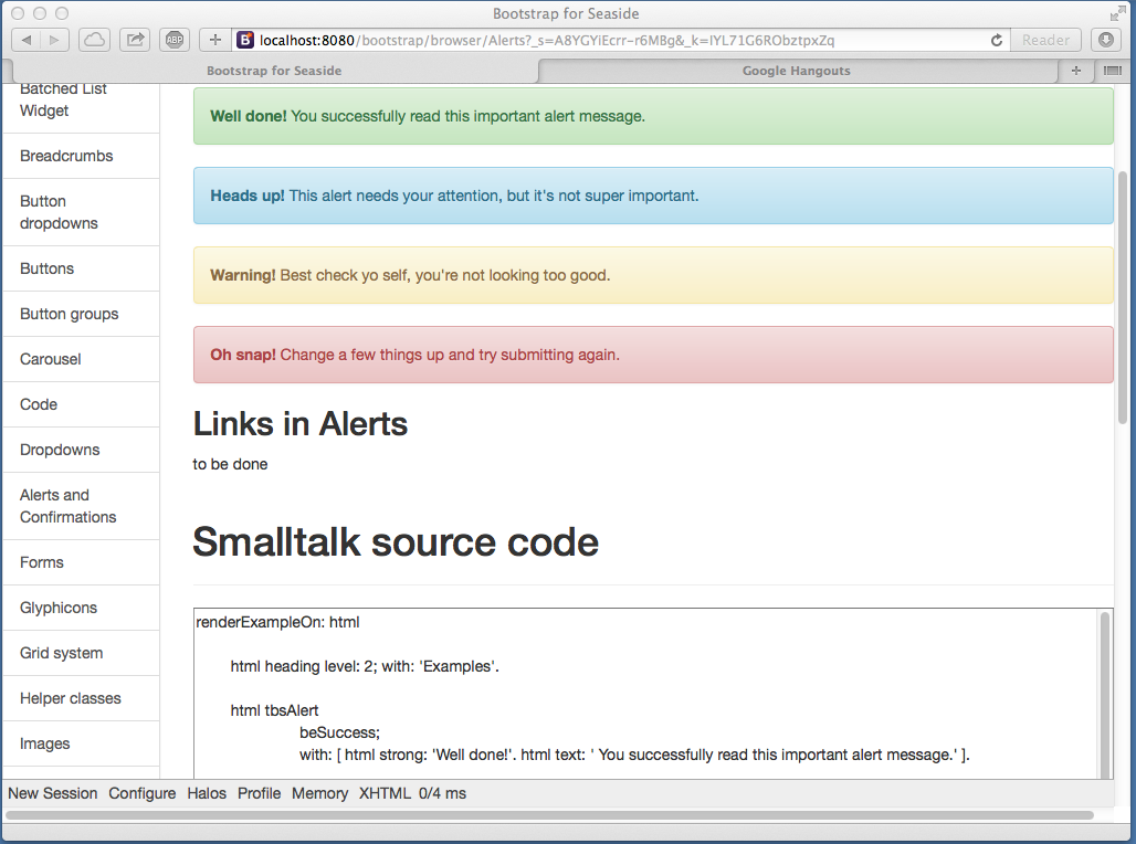
The Bootstrap library is accessible from Seaside as we will see. If you access the Seaside Bootstrap application in your web browser (bootstrap link in the list of Seaside application or directly access http://localhost:8080/bootstrap) you can see several examples as shown in figure 55.6.
If you click on the Examples link at the bottom of the web page you can see some graphical elements and their respective code to integrate them in your application (cf. figure 55.7).
55.7.1. Bootstrap
The Seaside Bootstrap library code and documentation is available here: http://smalltalkhub.com/#!/~TorstenBergmann/Bootstrap. There is also an online demo here: http://pharo.pharocloud.com/bootstrap. This library is already loaded in the PharoWeb image used in this tutorial.
55.8. Definition of TBHeaderComponent
Let's define a component to display the top of all components in our application.
WAComponent subclass: #TBHeaderComponent
   instanceVariableNames: ''
   classVariableNames: ''
   package: 'TinyBlog-Components'
The 'rendering' protocol contains the renderContentOn: method that displays our application header.
TBHeaderComponent >> renderContentOn: html
   html tbsNavbar beDefault with: [
      html tbsNavbarBrand
         url: '#';
         with: 'TinyBlog' ]
Our header is a simple navigation bar of Bootstrap (See Figure 55.8)
By default, in Bootstrap navigation bars, there is a link on tbsNavbarBrand. Since we consider that useless in our application, we used a '#' anchor. Now, when the user click on the title link, nothing happen.
Usually, clicking on an application title bring back the user to the web application home page.
55.9. Header Use
It is not desirable to instantiate the TBHeaderComponent each time a component is called.
So, we add an instance variable named header in the TBScreenComponent component and initializes it in its initialize method.
WAComponent subclass: #TBScreenComponent
   instanceVariableNames: 'header'
   classVariableNames: ''
   package: 'TinyBlog'

TBScreenComponent >> initialize
   super initialize.
   header := TBHeaderComponent new.
55.9.1. Composite-Component relationship
In Seaside, subcomponents of a component must be returned by the composite when sending it the children message.
So, we must define that the TBHeaderComponent instance is a children of the TBScreenComponent component in the Seaside component hierachy (and not in the Pharo classes hierarchy). We do so by specializing the method children.
TBScreenComponent >> children
   ^ OrderedCollection with: header
In the renderContentOn: method ('rendering' protocol), we can now display the subcomponent (the header):
TBScreenComponent >> renderContentOn: html
   html render: header
55.10. Using the Screen Component in our Application
Temporarily, we will directly use the TBScreenComponent while we develop other components.
So, we instantiate it in initialize method and store it in the instance variable main.
TBApplicationRootComponent >> initialize
   super initialize.
   main := TBScreenComponent new.
TBApplicationRootComponent >> renderContentOn: html
html render: main
We declare the containment relationship by returning main as children of TBApplicationRootComponent.
TBApplicationRootComponent >> children
   ^ { main }
If you refresh your application in a web browser, you should obtain what is depicted on Figure 55.8.
55.10.0.1. Possible Enhancements
The blog name should be customizable using an instance vairable in the TBBlog class and the application header component should display this title.
55.11. List of Posts
We will now display the list of all posts - which is the primary goal in fact. Remember that we speak about the public access to the blog here and not the administration interface that will be developped later.
Let's create a TBPostsListComponent inheriting from TBScreenComponent:
TBScreenComponent subclass: #TBPostsListComponent
   instanceVariableNames: ''
   classVariableNames: ''
   package: 'TinyBlog-Components'
Add a temporary renderContentOn: method (in the 'rendering' protocole) to test during development (cf. Figure 55.9).
TBPostsListComponent >> renderContentOn: html
   super renderContentOn: html.
   html text: 'Blog Posts here !!!'
Add this new component in the root application component:
TBApplicationRootComponent >> initialize
   super initialize.
   main := TBPostsListComponent new.
Modify this method is not a good practice so we add a setter method to dynamically change the component to display in the future.
But, we keep that by default the TBPostsListComponent component will be displayed.
TBApplicationRootComponent >> main: aComponent
   main := aComponent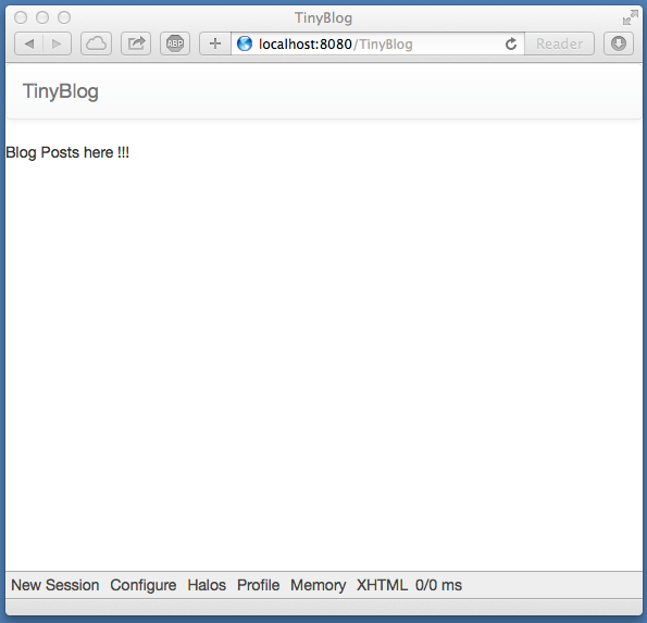
55.12. A Post Component
Now e will define TBPostComponent to display the deatils of a Post.
Each post will be graphically displayed by an instance of TBPostComponent which will show the post title, its date and its content.
WAComponent subclass: #TBPostComponent
   instanceVariableNames: 'post'
   classVariableNames: ''
   package: 'TinyBlog-Components'
TBPostComponent >> initialize
super initialize.
post := TBPost new.TBPostComponent >> title
^ post titleTBPostComponent >> text
^ post textTBPostComponent >> date
^ post date
The renderContentOn: method defines the HTML rendering of a post.
TBPostComponent >> renderContentOn: html
   html heading level: 2; with: self title.
   html heading level: 6; with: self date.
   html text: self text
55.12.0.1. About HTML Forms
Next week, we will develop the administration web UI using Magritte and this will demonstrate that it is not common at all to manually develop components as we explained above. Indeed, Magritte is used to describe model data and then offers automatic Seaside component generators. As we will see, all the code of the previous section could be done just with:
TBPostComponent >> renderContentOn: html
   html render: post asComponent
55.13. Display Posts
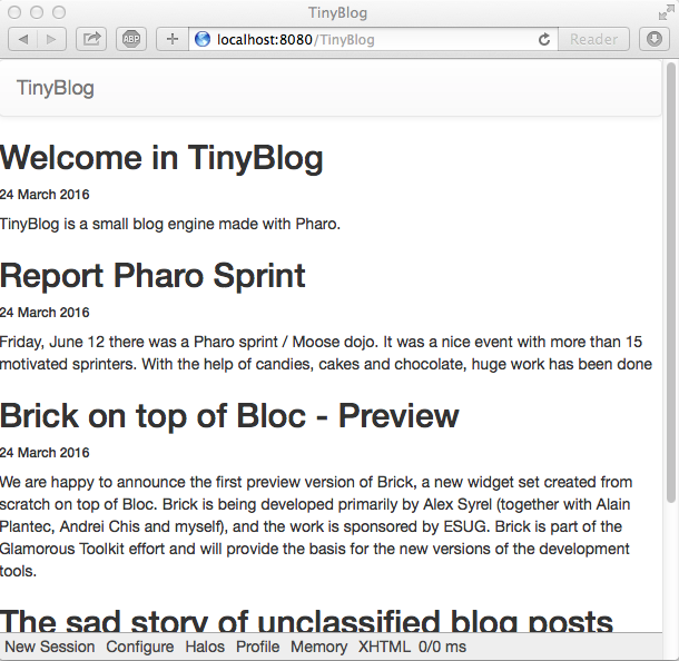
To display all visible posts in the database, we just need to modify the TBPostsListComponent >> renderContentOn: method:
TBPostsListComponent >> renderContentOn: html
super renderContentOn: html.
self blog allVisibleBlogPosts do: [ :p |
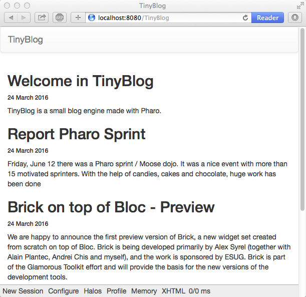
html render: (TBPostComponent new post: p) ]Refresh you web browser and you should get ... the following error:
Not Found /TinyBlog
55.14. Debugging Errors
By default, when an error occurs in a web application, Seaside returns an HTML page that contains a generic message. You can change this message or during development, you can configure Seaside to open a debugger directly in Pharo IDE. To configure Seaside, just execute the following snippet:
(WAAdmin defaultDispatcher handlerAt: 'TinyBlog')
    exceptionHandler: WADebugErrorHandler
Now, if you refresh the web page in your browser, a debugger should open on Pharo side. If you analyze the stack, you should see that we forgot to define the following method:
TBPostComponent >> post: aPost
	post := aPost
The web application should now correctly renders and you obtains what is shown in Figure 55.10.
55.15. Displaying the List of Posts with Bootstrap
Let's use Bootstrap to make the list of posts more beautiful using a Bootstrap container.
TBPostsListComponent >> renderContentOn: html
   super renderContentOn: html.
   html tbsContainer: [
   self blog allVisibleBlogPosts do: [ :p |
      html render: (TBPostComponent new post: p) ] ]
Yous web application whould look like Figure 55.11.
55.16. Displaying Posts by Category
Posts are classified into categories. By default, a post is classified into a special category named "Unclassified" if nothing is specified.
We will now create a new component named TBCategoriesComponent to manage the list of categories.
55.16.1. Category Component Definition
TBCategoriesComponent is responsible to display the list of all categories available in the database (the model) and also to select one category. This component should be able to communicate with the TBPostsListComponent to pass it the currently selected category.
WAComponent subclass: #TBCategoriesComponent
   instanceVariableNames: 'categories postsList'
   classVariableNames: ''
   package: 'TinyBlog-Components'
TBCategoriesComponent >> categories
^ categoriesTBCategoriesComponent >> categories: aCollection
categories := aCollectionTBCategoriesComponent >> postsList: aComponent
postsList := aComponentTBCategoriesComponent >> postsList
^ postsListOn class-side, we define a creation method.
TBCategoriesComponent class >> categories: aCollectionOfCategories postsList: aTBScreen
   ^ self new categories: aCollectionOfCategories; postsList: aTBScreen
The selectCategory: method (protocol 'action') communicates the currently selected category to the TBPostsListComponent.
TBCategoriesComponent >> selectCategory: aCategory
   postsList currentCategory: aCategory
In TBPostsListComponent, we now add an instance variable to store the current category.
TBScreenComponent subclass: #TBPostsListComponent
   instanceVariableNames: 'currentCategory'
   classVariableNames: ''
   package: 'TinyBlog-Components'
TBScreenComponent >> currentCategory
^ currentCategory
TBScreenComponent >> currentCategory: anObject
currentCategory := anObject55.17. Category Rendering
We add a rendering method ('rendering' protocol) to display one category. A category is rendered as a link and that make this category the current one if the user click on it.
TBCategoriesComponent >> renderCategoryLinkOn: html with: aCategory
   html tbsLinkifyListGroupItem
      callback: [ self selectCategory: aCategory ];
      with: aCategory
Finally, the renderContentOn: method of the TBCategoriesComponent is now straighforward, it just iterates over all categories and renders them using bootstrap brushes:
TBCategoriesComponent >> renderContentOn: html
   html tbsListGroup: [
      html tbsListGroupItem
         with: [  html strong: 'Categories' ].
      categories do: [ :cat |
         self renderCategoryLinkOn: html with: cat ]]
It remains to display the list of categories in the root application component and refresh the list of displayed posts regarding the currently selected category.
55.18. Refreshing the List of Posts
We have to modify some methods of TBPostsListComponent.
First, the readSelectedPosts method returns the posts to display.
If the current category is nil, it means that the user did not select any category yet and all visible posts of the database are displayed.
If the user has selected a category, only posts of this category are displayed.
TBPostsListComponent >> readSelectedPosts
   ^ self currentCategory
      ifNil: [ self blog allVisibleBlogPosts ]
      ifNotNil: [ self blog allVisibleBlogPostsFromCategory: self currentCategory ]
Then, the method that renders the list of posts can be modified as follows:
TBPostsListComponent >> renderContentOn: html
   super renderContentOn: html.
   html render: (TBCategoriesComponent
               categories: (self blog allCategories)
               postsList: self).
   html tbsContainer: [
      self readSelectedPosts do: [ :p |
         html render: (TBPostComponent new post: p) ] ]
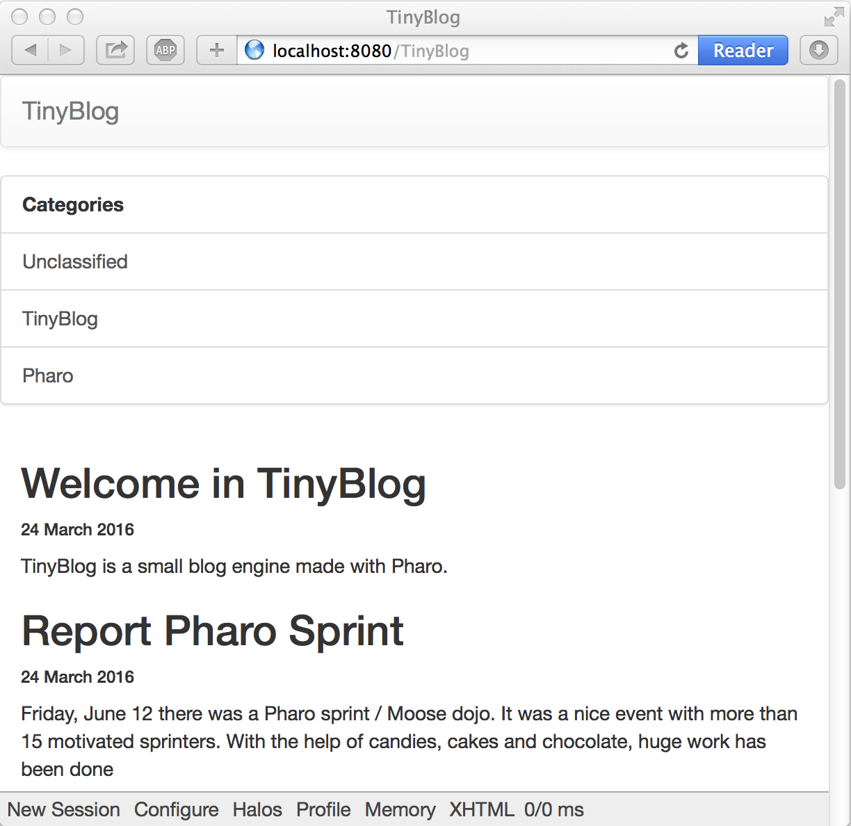
An instance of TBCategoriesComponent is rendered on the web page and allows users to select a category (See Figure 55.12).
55.19. Look and Layout
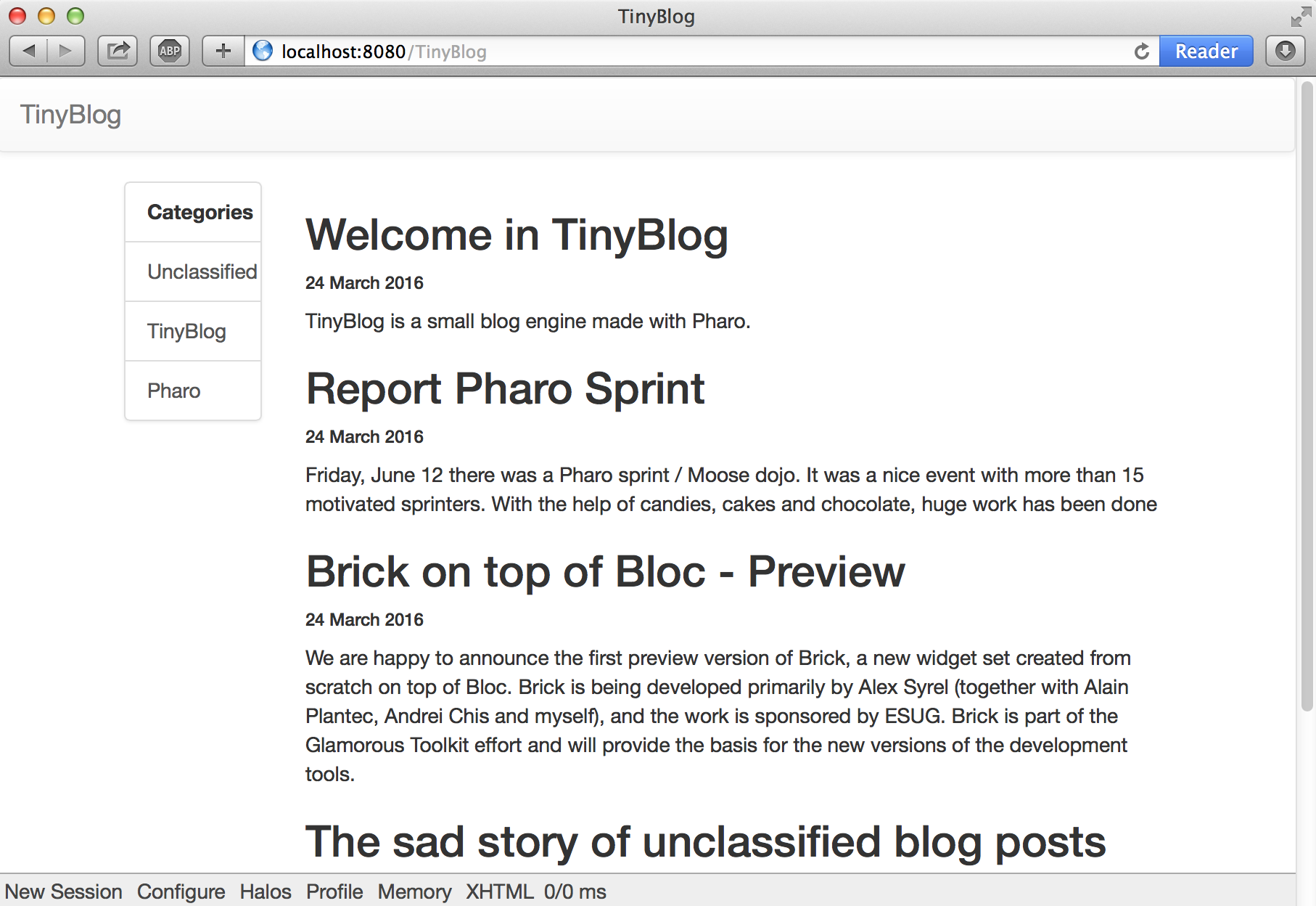
We will improve the layout of TBPostsListComponent using a repsonsive design for the list of posts.
It means that the CSS will adapt the component size and placement based on the available space.
Components are displayed inside two Bootstrap containers in a row and two columns. Column width is determined according to the resolution (viewport) of the displaying device. The 12 columns of the Bootstrap grid are splitted between the list of categories and list of posts. If a low resolution is used, the list of categories will be above the list of posts (each lists will occupy 100% of the width of the container).
TBPostsListComponent >> renderContentOn: html
   super renderContentOn: html.
   html tbsContainer: [
      html tbsRow showGrid;
         with: [
            html tbsColumn
               extraSmallSize: 12;
               smallSize: 2;
               mediumSize:  4;
               with: [
                  html render: (TBCategoriesComponent
                    categories: (self blog allCategories)
                    postsList: self) ].
      html tbsColumn
               extraSmallSize: 12;
               smallSize: 10;
               mediumSize: 8;
               with: [
         self readSelectedPosts do: [ :p |
             html render: (TBPostComponent new post: p) ] ] ] ]
You should now obtain the same look as in Figure 55.13.
When you select a category, the list of posts is correctly refreshed. However, the current category is not highlighted. To introduce this feature, we modify the following method:
TBCategoriesComponent >> renderCategoryLinkOn: html with: aCategory
   html tbsLinkifyListGroupItem
      class: 'active' if: aCategory = self postsList currentCategory ;
      callback: [ self selectCategory: aCategory ];
      with: aCategory
The application works well but you must not keep the current implementation of TBPostsListComponent >> renderContentOn:.
This method is too long and cannot be easily reused. Propose a solution.
55.20. Our Solution: Small Methods
TBPostsListComponent >> renderContentOn: html
   super renderContentOn: html.
   html
      tbsContainer: [
         html tbsRow
            showGrid;
            with: [ self renderCategoryColumnOn: html.
                  self renderPostColumnOn: html ] ]
TBPostsListComponent >> renderCategoryColumnOn: html
html tbsColumn
extraSmallSize: 12;
smallSize: 2;
mediumSize: 4;
with: [ self basicRenderCategoriesOn: html ]TBPostsListComponent >> basicRenderCategoriesOn: html
^ html render: (TBCategoriesComponent
categories: self blog allCategories
postsList: self)TBPostsListComponent >> renderPostColumnOn: html
html tbsColumn
extraSmallSize: 12;
smallSize: 10;
mediumSize: 8;
with: [ self basicRenderPostsOn: html ] TBPostsListComponent >> basicRenderPostsOn: html
^ self readSelectedPosts do: [ :p |
html render: (TBPostComponent new post: p) ]We are now ready to define a administrative UI for TinyBlog.
55.21. Possible Enhancements
For example, you can:
- sort categories by name
- add a link named 'All' in the list of categories to display all visible posts regardless of their category
Figure 55.14 shows the final application you may have developped.
